
Project Type
Brand Identity & Packaging Design
Context
Standalone fictional design brief
Territory
Grown, Not Made
Tools
Miro, Adobe Illustrator, Adobe Firefly (mock-ups only)
The Client
Orchard & Grain is a small-batch cereal producer based in the North Yorkshire Dales. The business is run by husband-and-wife team Tom and Sarah Whitfield, who left careers in hospitality and agriculture respectively to start making granola and muesli from grains and fruit grown on farms within a fifteen-mile radius of their home.
They sell at three regular farmers' markets in Harrogate, Skipton, and Ilkley. In the past six months they have had informal interest from two independent delicatessens in Leeds and a farm shop in the Ribble Valley. They want to build a brand that can support a move into these retail environments and, eventually, an online direct-to-consumer channel.
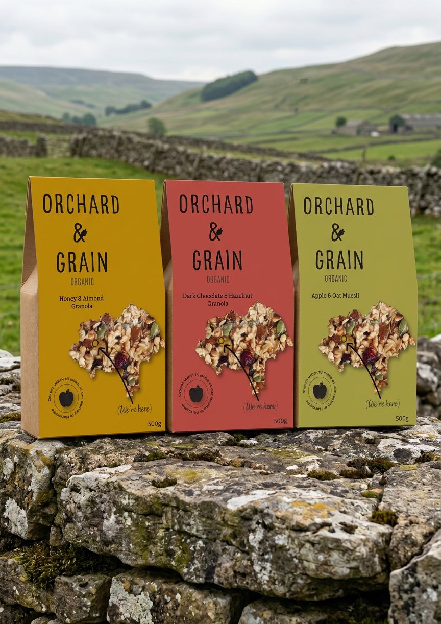
The product range currently consists of three SKUs: a toasted granola with honey and almond, a muesli with dried apple and oat, and a granola with dark chocolate. Seasonal variants are planned.
Tom and Sarah have no existing brand identity. They currently sell in plain kraft bags with a hand-stamped label. The informality has charm at a farmers' market but will not stand up to shelf scrutiny next to established competitors. The brief is to create something that retains honesty and warmth while adding the visual authority needed for retail.
Target Audience
Age
28–48
Location
Market towns and cities across the north of England; also reachable online nationally.
Lifestyle
Cooks regularly. Buys from butchers, farm shops, and independent grocers when available. Aware of where food comes from but not evangelistic about it.
Attitude to Food
Values provenance and craft. Willing to pay a premium for quality but distrusts brands that perform their values rather than living them.
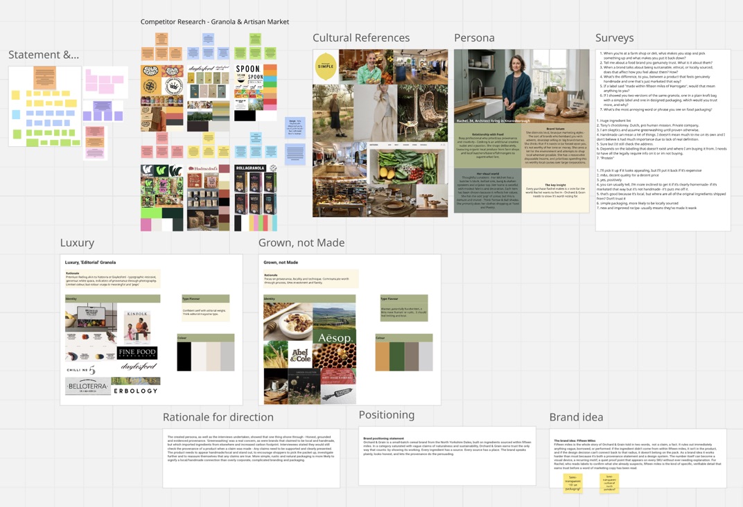
Research & Strategy
I used Miro to get my head around the competition, pull together what people told me, and work out where the brand could sit. A short survey and a few interviews kept landing on the same thing: people are wary of greenwashing and tend to check claims before they trust them. I built a persona around that: Rachel, 34, an architect living in Knaresborough. I kept checking my decisions against her.
What the audience told me
“I am a sceptic and assume greenwashing until proven otherwise.”
Audience Insight · Trust“Simple packaging, more likely to be locally sourced.”
Audience Insight · Packaging“New and improved recipe usually means they've made it worse.”
Audience Insight · AuthenticityRationale & Positioning
The research kept pointing one way: honesty over polish. The people I spoke to were more suspicious of fancy branding than won over by it; the harder a brand tried to look “natural”, the less they believed it.
So the packaging needed to feel like it genuinely came from a small North Yorkshire producer: simple, a bit rustic, and easy to believe. I used the fifteen-mile idea as a rule of thumb: if an ingredient isn't grown within fifteen miles, it's not in the product, and if a design choice doesn't tie back to that, it probably doesn't belong on the pack.
I worked up two creative territories. Luxury Editorial felt too corporate and a little forced, so I set it aside. Grown, Not Made felt far more honest and let the provenance story do the talking, so that's the one I ran with.
Orchard & Grain is a small-batch cereal brand from the North Yorkshire Dales, made with ingredients sourced within fifteen miles. In a category full of vague claims about being natural and sustainable, Orchard & Grain earns trust by showing its working: every ingredient has a source, and every source has a place. The brand keeps things plain, looks honest, and lets the provenance do the persuading.
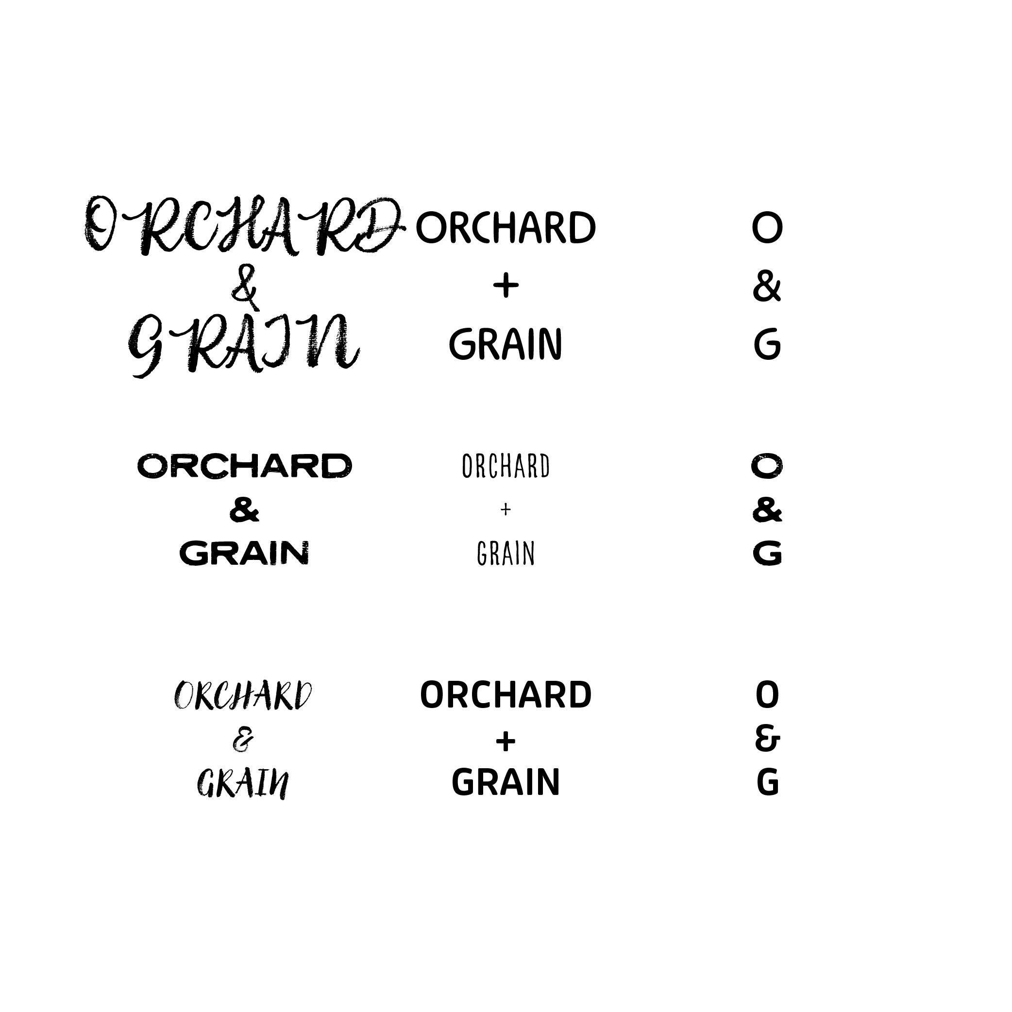
Type & Mark Exploration
With the territory settled, I moved into Illustrator to play with how the wordmark, county outline, stamp and flavour names could sit together on the pack. I worked up three directions, each leaning on the fifteen-mile idea and the North Yorkshire link in a slightly different way.
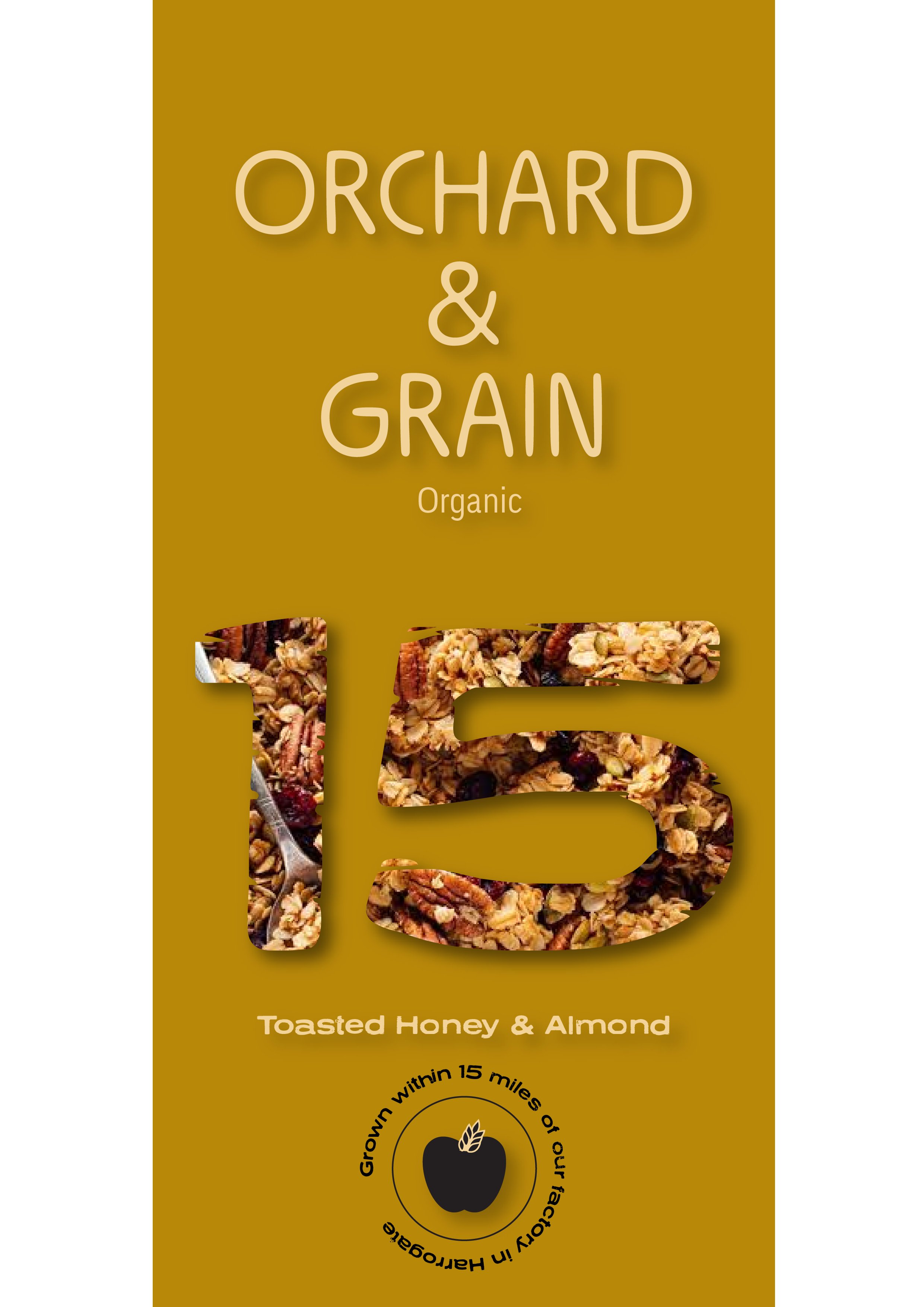
01The first one leaned hard into the fifteen miles, with a big “15” as a cellophane window and the granola showing through. I liked how bold it was, but the North Yorkshire link got lost, and it ended up repeating what the stamp was already saying.
02This is the one I ended up choosing and refining: wordmark, North Yorkshire county outline and provenance stamp all working together, letting the place do the talking.
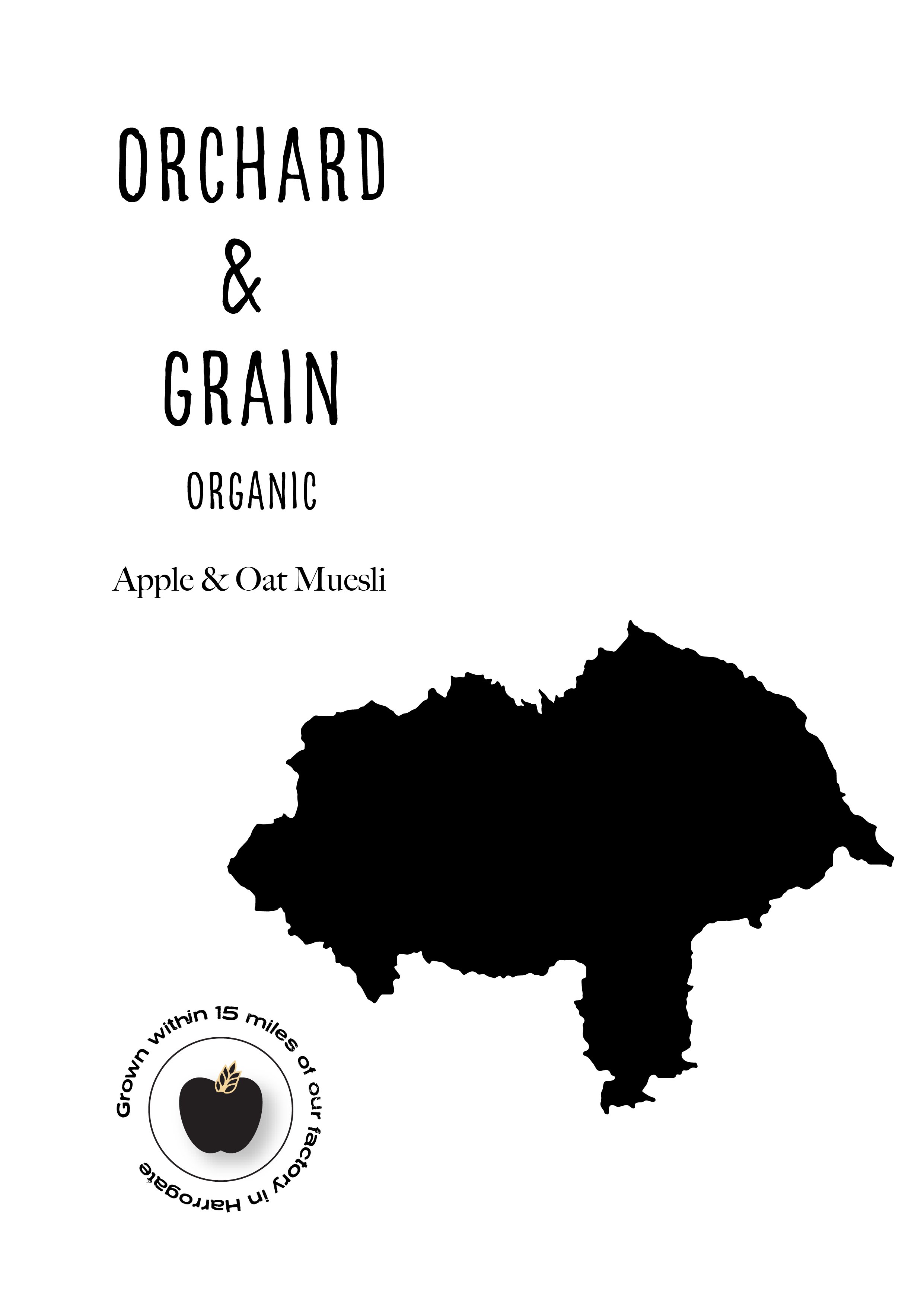
03The third dropped the stamp and put the apple & grain icon above the wordmark, with a little farm marker pinning the Harrogate factory inside the county. It felt a bit more premium and I was fond of it, but the North Yorkshire and fifteen-mile cues got too subtle, and it drifted away from the rustic feel I was after.
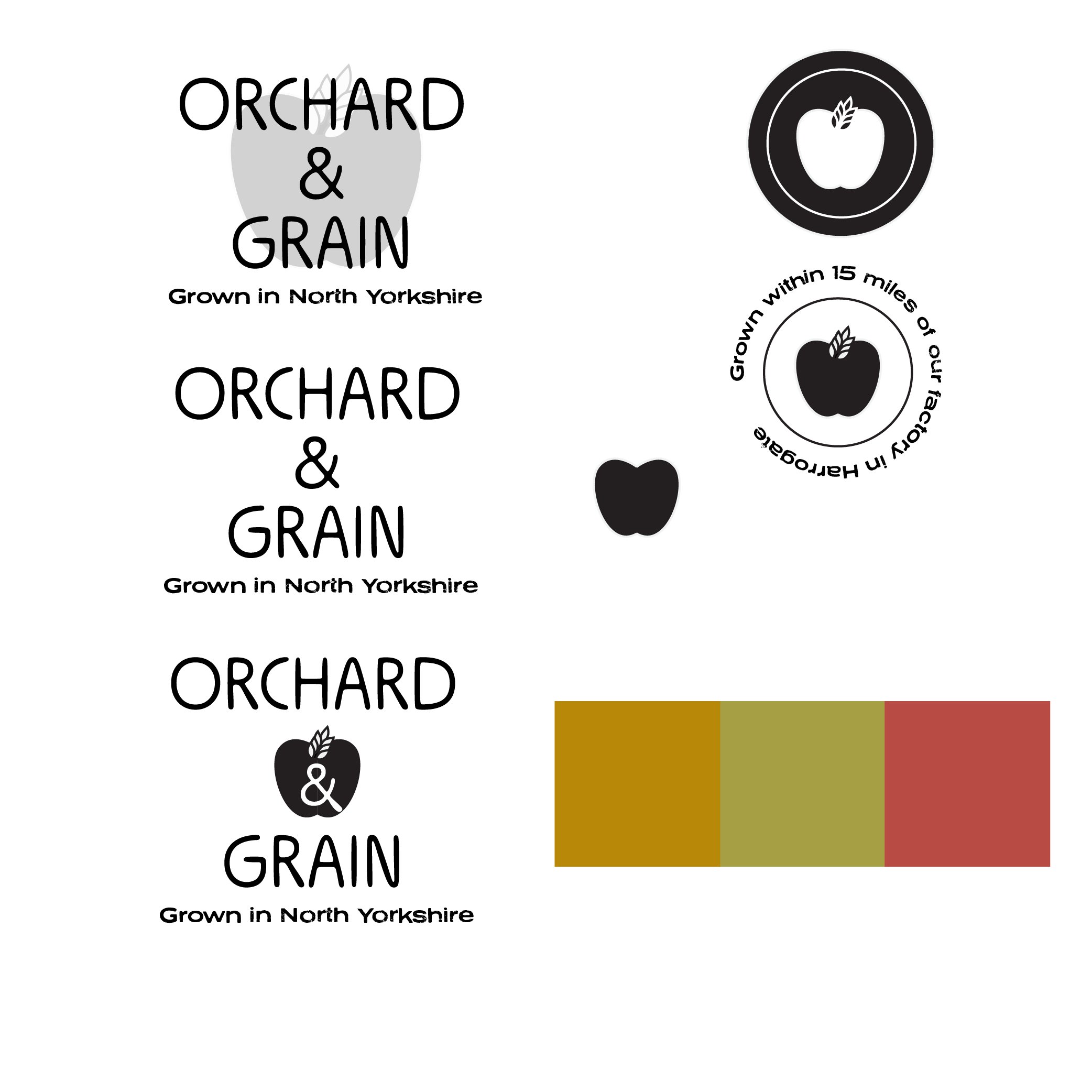
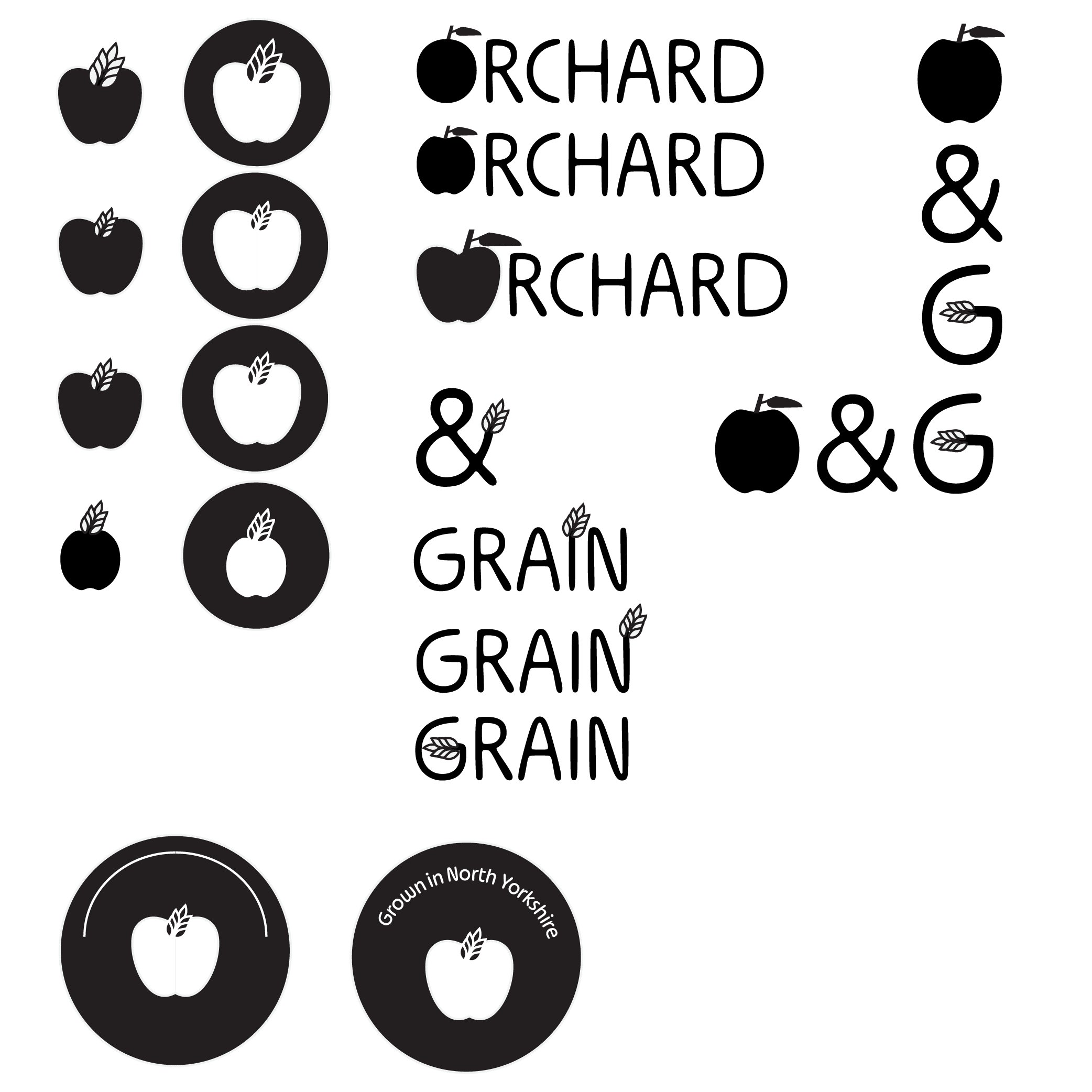
Final Mark & Variants
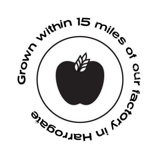
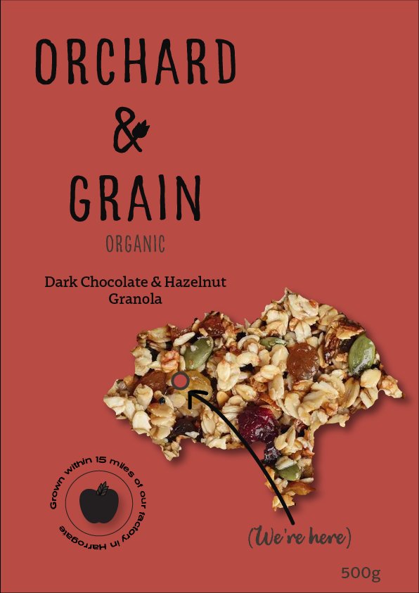
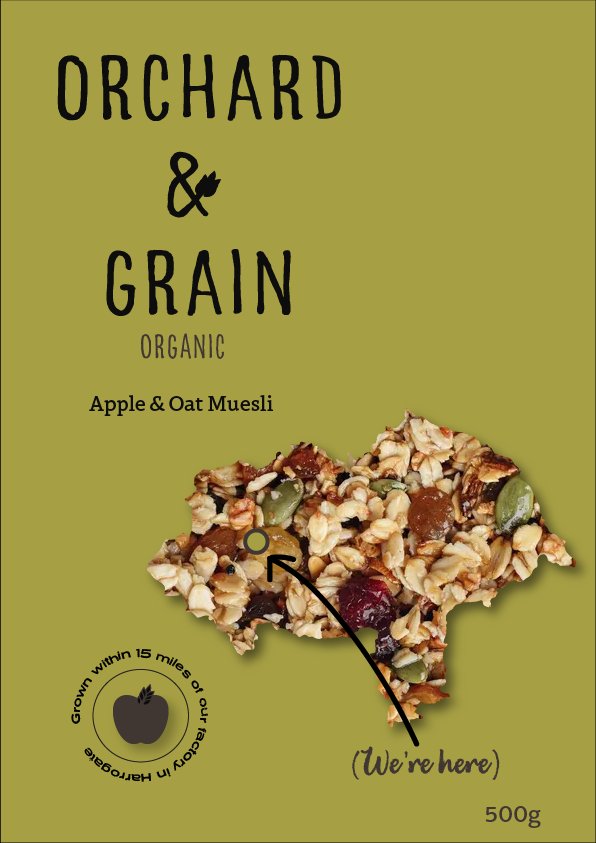
The mark pairs a silhouetted apple (the orchard) with a sheaf of grain growing out of the stem, small enough to work as a tiny stamp but distinctive enough to stand on its own. I wanted it to be easy to move around, so it works just as well printed on a kraft box as it does on a sticker sealing a bag of granola. The circular stamp version carries the “Grown within 15 miles of our factory in Harrogate” line, so the provenance claim turns up wherever the brand does.
Typography
Palette
#C49A1A Orchard Red
#B84A3A Dales Sage
#8A9A3A Oat Cream
#F5F0E8 Millstone
#1A1A18
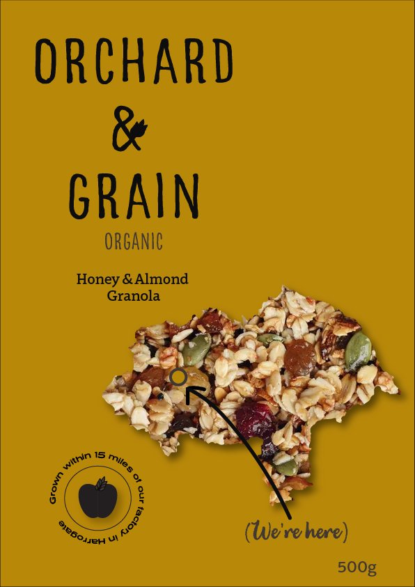
Each flavour gets its own background colour: honeyed grain for Honey & Almond, orchard red for Dark Chocolate & Hazelnut, dales sage for Apple & Oat Muesli. It's built to grow easily: a new flavour just takes a new colour, while everything else on the pack stays the same.
Packaging Design
The North Yorkshire county outline doubles as a window onto the product: you see the granola itself inside the shape of the place it comes from. A little “We're here” marker sits inside the outline, pinning the factory in Harrogate. Instead of shouting the distance with a big “15” (something I tried early on), the final packs let the stamp carry the “grown within 15 miles” line and keep the focus on North Yorkshire itself.
Constraints & Scalability
The Cellophane Window
The trickiest thing to actually produce is the North Yorkshire outline as a cellophane window cut into the front panel, with the round stamp sitting on top. Cutting both a freeform shape and a separate circle into a box is probably a stretch on a normal print run, so in reality this would need adapting: printing the shape rather than die-cutting it, or simplifying it to a rectangular window with the map sitting behind as a graphic.
Expanding the Range
Because the system is led by colour, adding a new flavour is easy. Everything else (layout, type, icon) stays the same; you just pick a new colour and drop it into the master Illustrator file. With the stamp, icon, wordmark and layout all locked, the range stays consistent without much effort.
Format Flexibility
I designed the icon to travel well. It holds up tiny (on-pack stamps, sticker seals) and big (signage, market-stall headers), and the stamp version, “Grown within 15 miles of our factory in Harrogate”, works on its own on other bits and pieces too: tote bags, tissue paper, shelf wobblers.
The County Silhouette
North Yorkshire is an awkward shape: easy to recognise at A3, less so on the side of a granola bag. The “We're here” marker helps give people some context, but I'd want to test it at real print size to be sure the shape still reads clearly without a label.
Outcome
“Every design decision had to earn its place by connecting back to the fifteen-mile radius.”
I'm really pleased with where this ended up. It started as audience research and grew into a full three-SKU packaging range, all held together by one idea, Fifteen Miles, that works as the positioning, the design system and the trust signal at the same time, without needing a paragraph of marketing copy to prop it up.
It feels like the brief was met: a complete, believable artisan brand with a clear strategy, a flexible identity, and packaging that puts honest, checkable provenance front and centre. The obvious caveat is production: the die-cut county window in particular would likely need amending or simplifying to actually print at scale, and I'd expect a few details to shift once they'd been through a real print test.
The best part was the feedback. When I showed the packs to the people I'd interviewed, they said it's exactly the sort of thing that would catch their eye in a farm shop, and that they'd be likely to pick it up and buy it. For a brand built entirely on earning trust, that felt like the right result.