
Role
Solo - UX Researcher, UX & UI Designer
Brief
Design a new e-commerce platform for gamers to purchase equipment.
Responsibilities
Surveys, persona development, empathy mapping, user flow, lo-hi wireframing, usability testing
Tools
Figma, Miro, Google Forms, Figma Make
Constraints - This was a fictitious brief with no stakeholder access. To compensate, I leaned into quantitative survey research distributed through real gaming communities that I'm a part of, to ensure real problems were being solved.
What do Gamers Struggle with when Purchasing Components?
A Survey across a number of gaming communities surfaced eight consistent pain points. I decided to focus on the four highest rated:
Specifications are fragmented
Hard to find or incomplete
Comparison tools are lacking
Lack of trust that items are suggested because they are truly an upgrade, rather than a marketing strategy
Reviews are untrustworthy
Users struggle to find reviews reliable, feeling uncertain whether they are AI or, again, a marketing strategy
Compatibility is a blocker
Lack of reassurance without completing additional, extensive third-party research
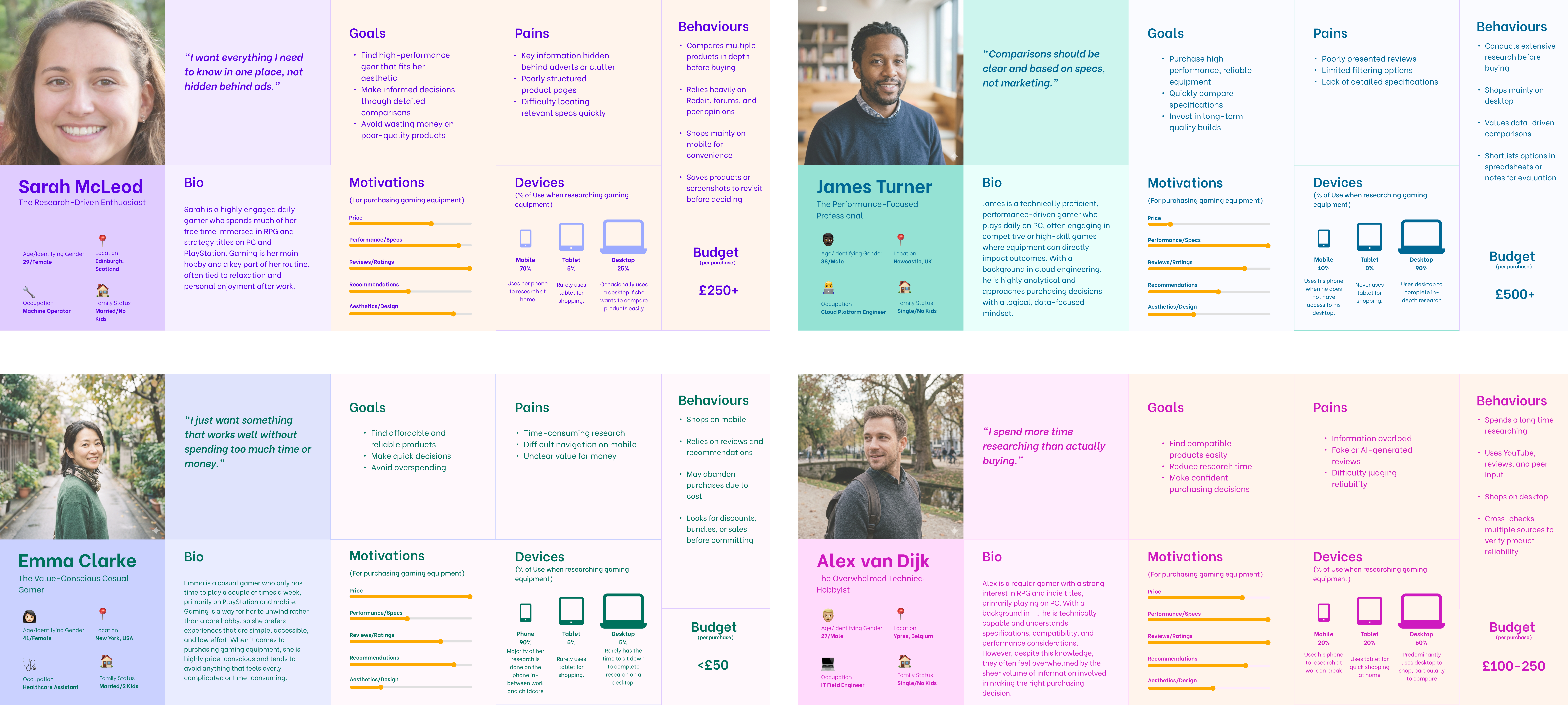
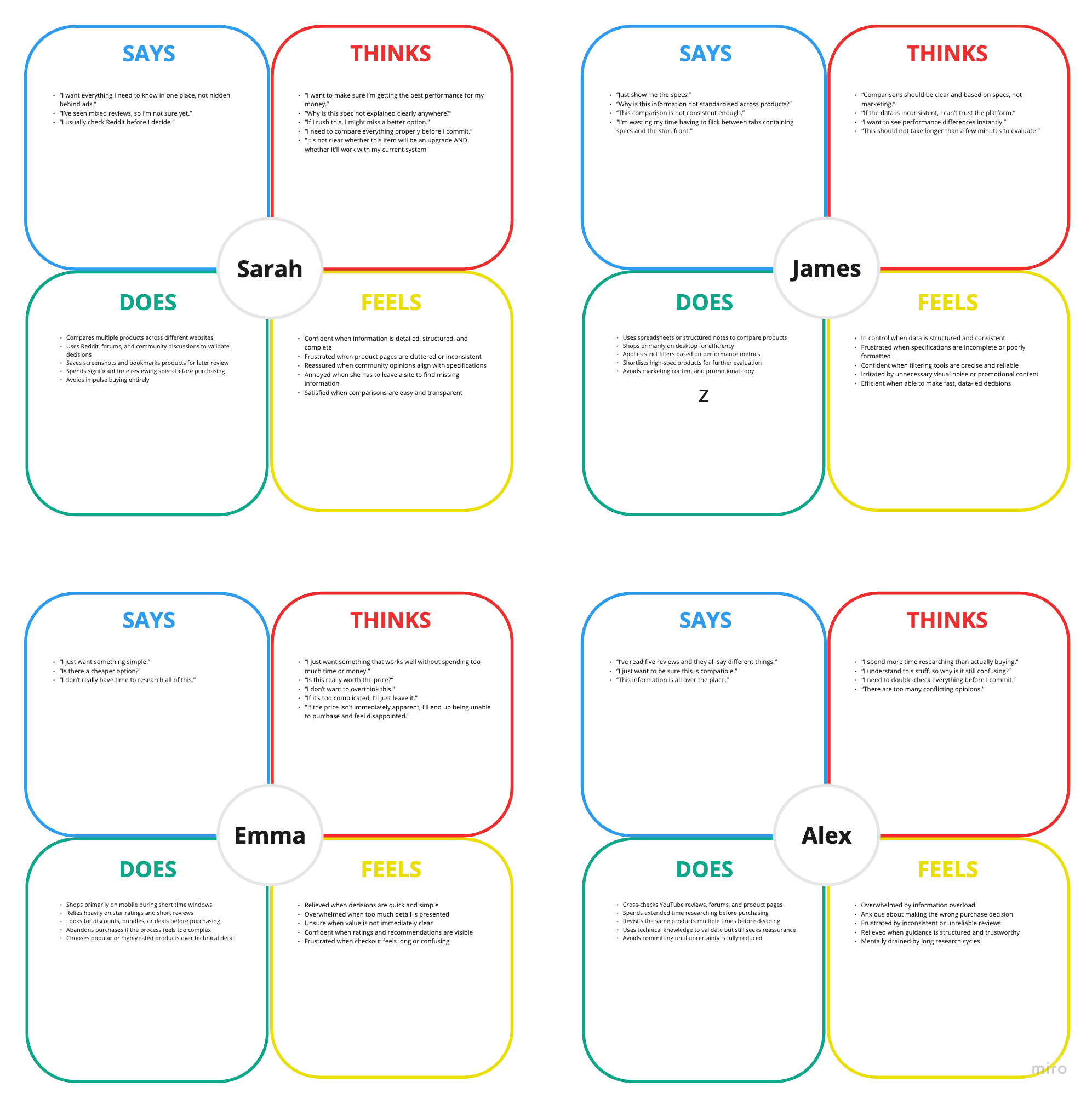
Personas, Empathy Maps and the Problem
Survey data was synthesised into four research-led personas as follows: Sarah (spec-focused), James (performance-driven), Emma (budget-first), and Alex (compatibility-anxious). An aggregated empathy map confirmed similar issues and barriers across all user types.
Gamers abandon purchases or leave the site when they can't verify compatibility, trust reviews or understand value.
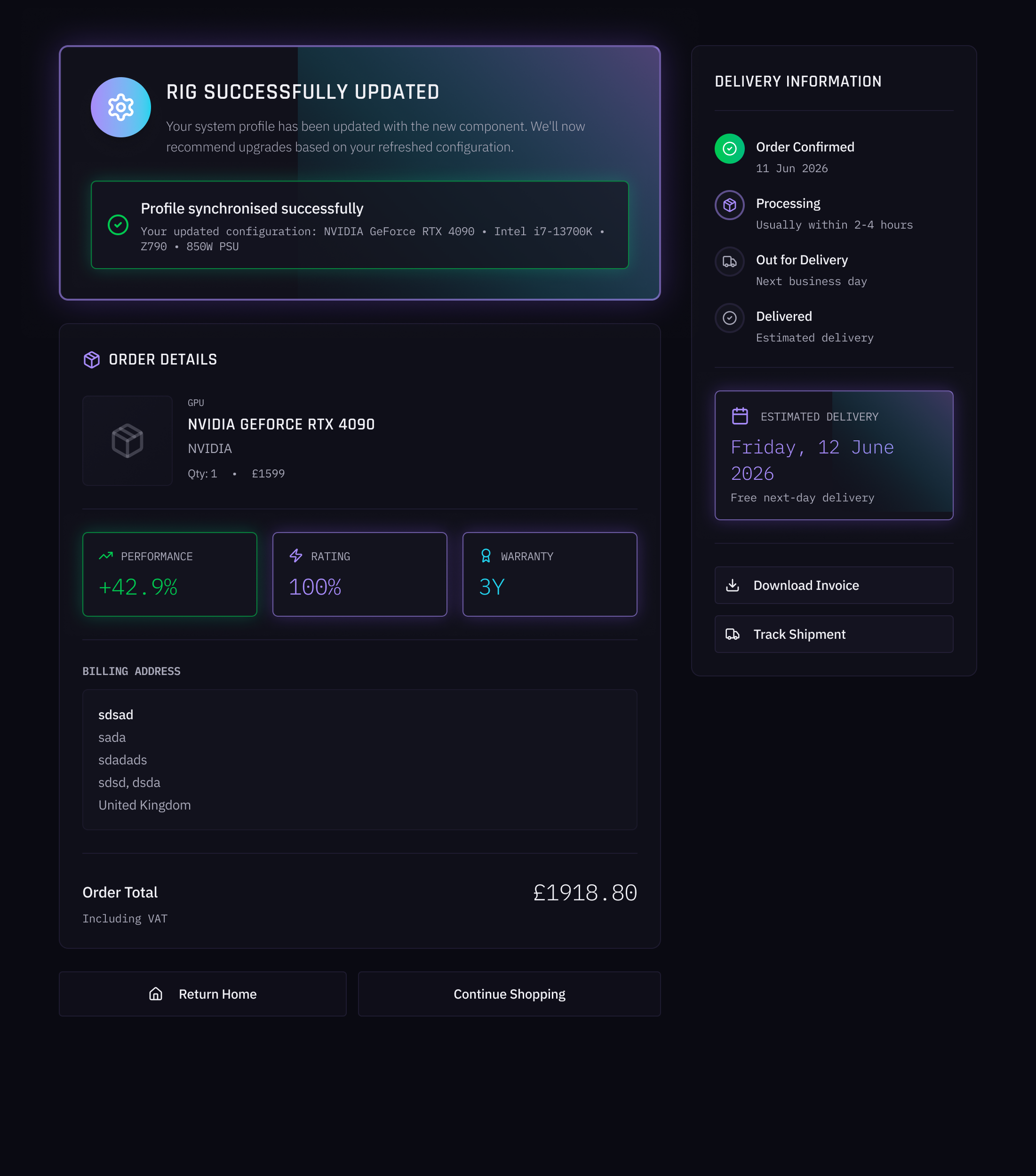
One platform: browse → research → measure → purchase. A compatibility engine, expert review embeds, and visual value signals to eliminate off-site research leading to drop-offs.
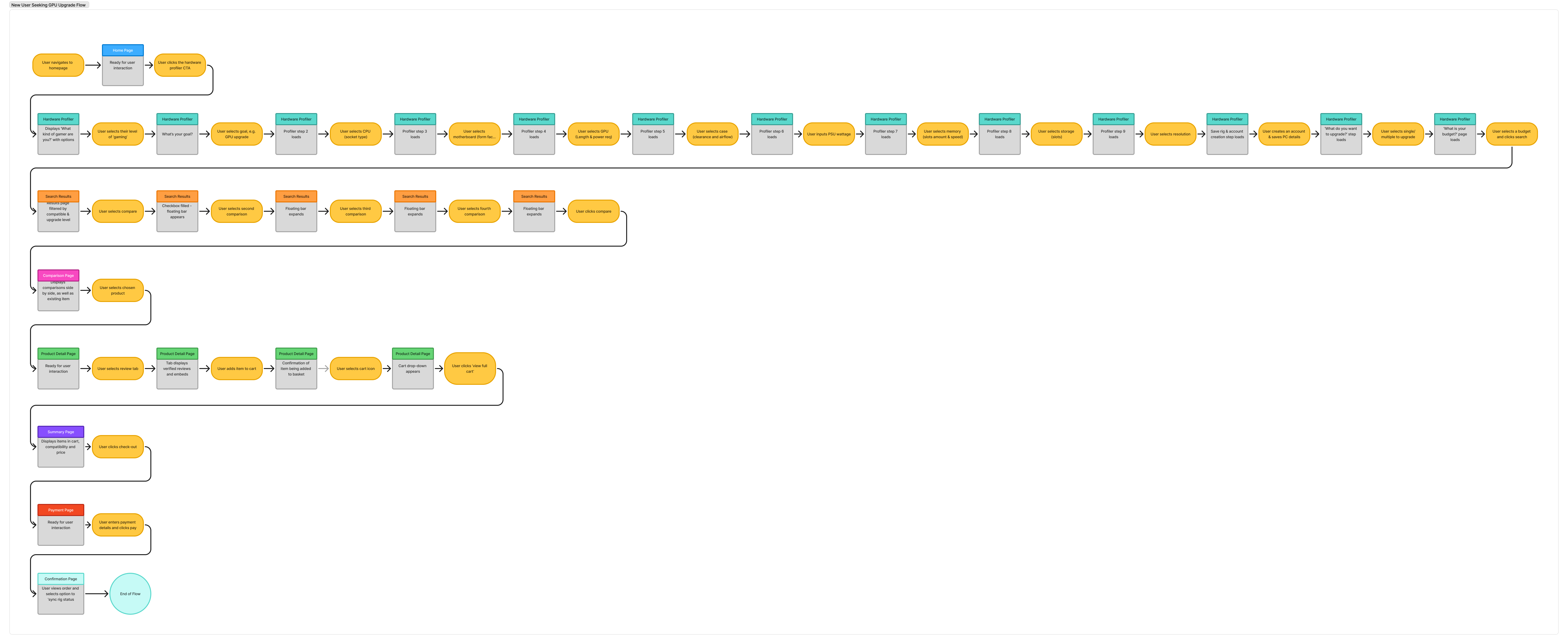
Structuring the Solution Around User Flows
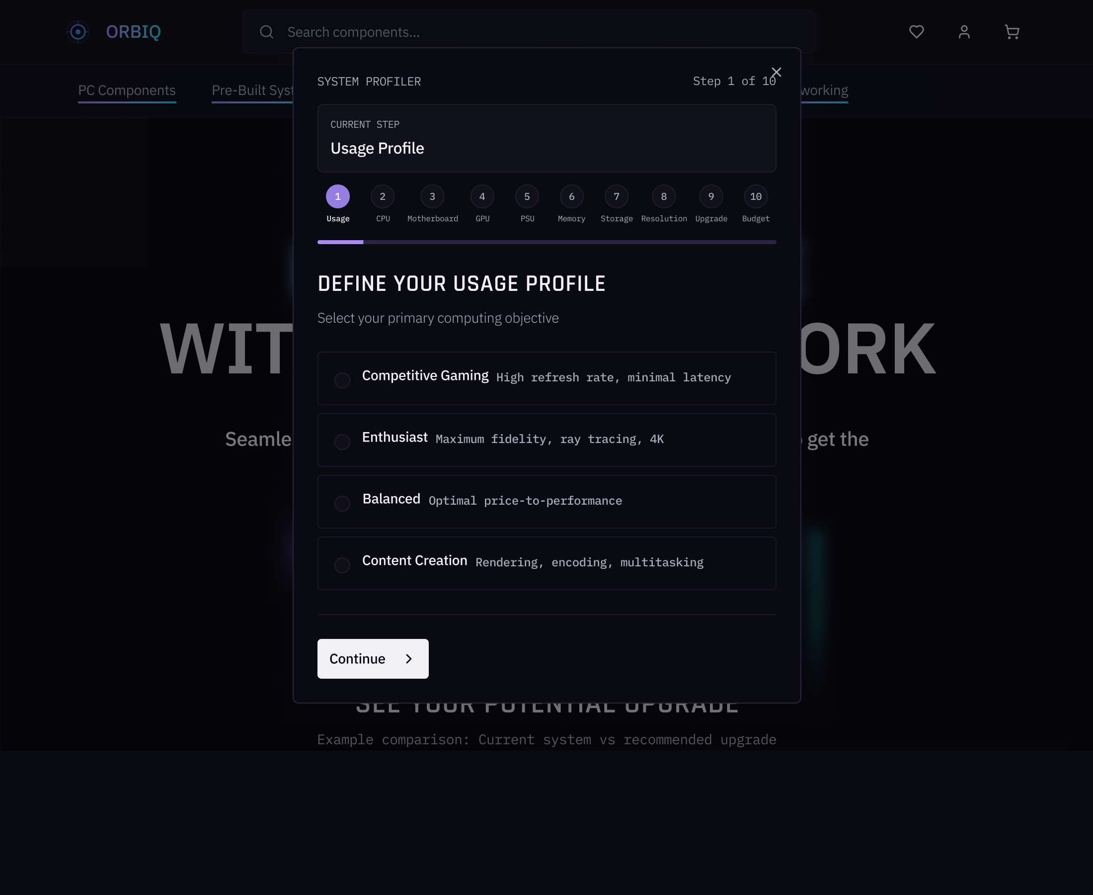
A user map was designed around a new user seeking to upgrade their GPU. Three main decisions informed the structure of the site's information architecture.
Rather than being confronted with a generic shopfront, new users begin by building their current setup. Every component shown is pre-verified against their system, directly addressing compatibility anxiety before a single product is viewed.
Saved hardware data suggests logical upgrade paths and flags performance mismatches, e.g. a GPU that can't output 4K when the system knows that the user has a 4K monitor, shifting the experience toward efficiency for repeat visitors and saving valuable time.
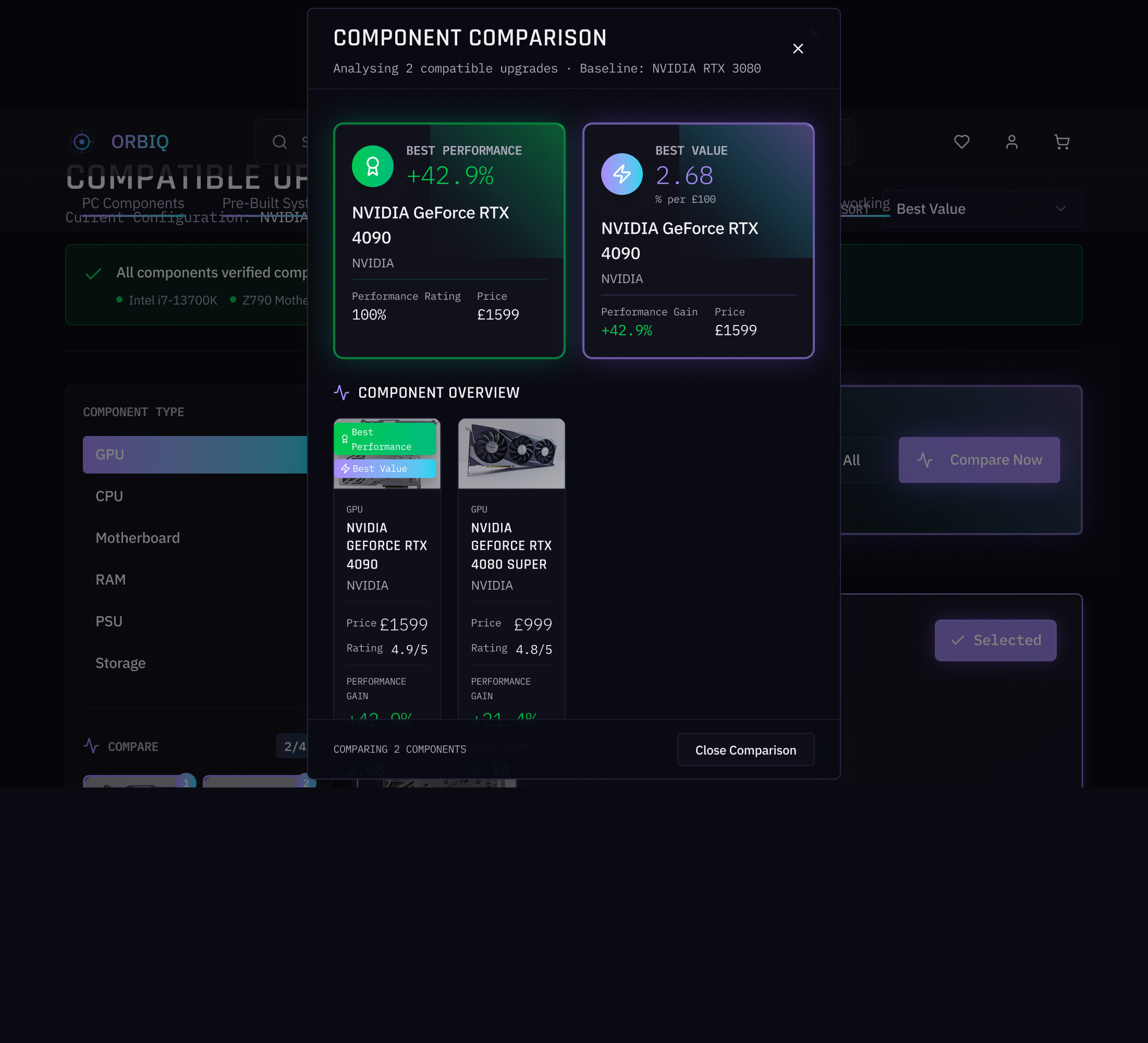
Trusted industry content sits alongside verified purchase reviews in-page, eliminating the drop-off risk of users leaving to research elsewhere, providing that reassurance that products aren't being suggested as part of a marketing strategy.
From Wireframes to High Fidelity
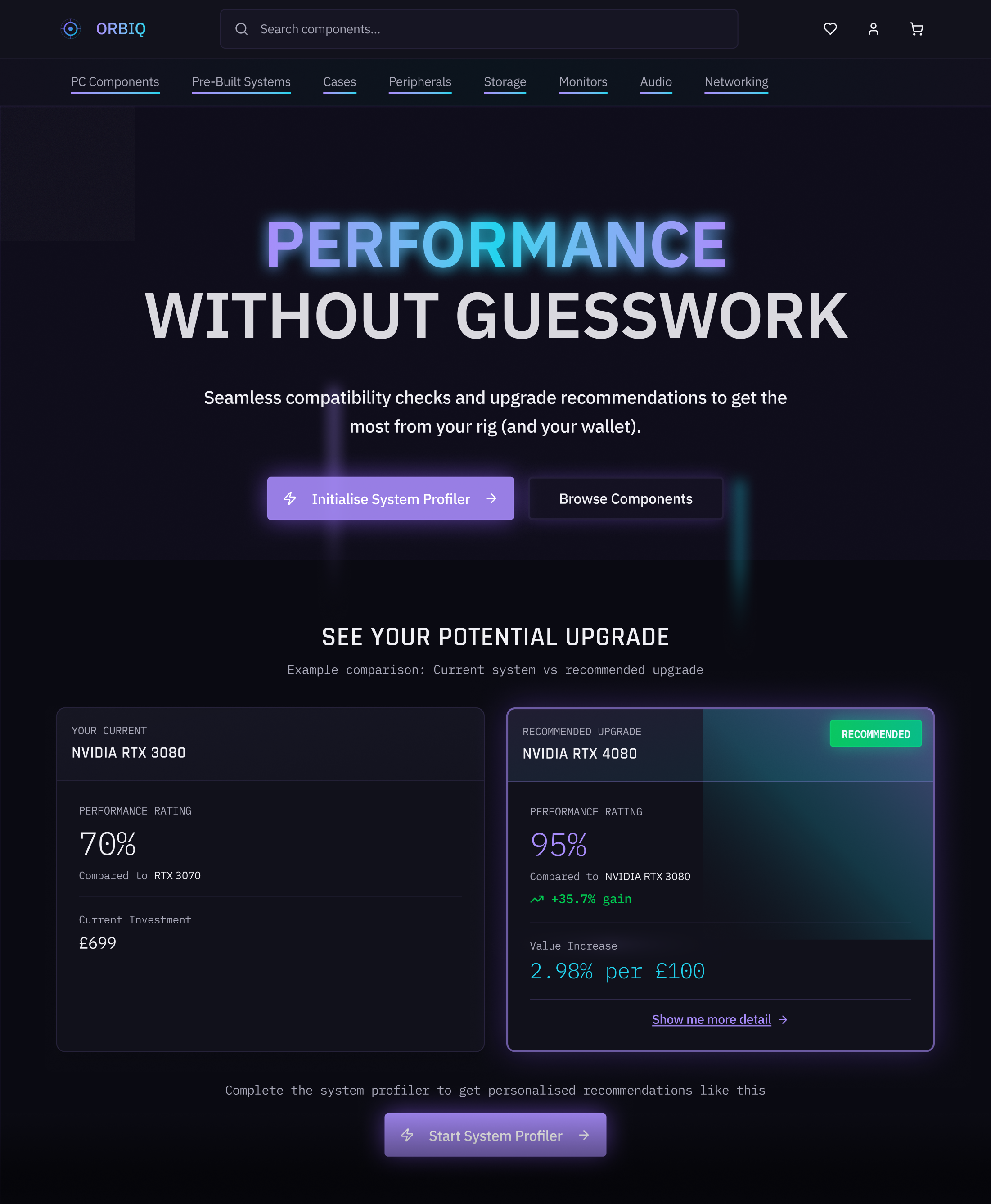
Low and mid-fidelity wireframes established a hierarchy before visual styling. The high-fidelity phase introduced a dark mode aesthetic: charcoal, purple and cyan accents, designed to feel premium and native to the gaming context. I also wanted to lean into a 'sci-fi' type theme in line with the title for the site I had chosen. I additionally utilised Figma Make to expedite early iteration.
Usability Testing
Following completion of the high-fidelity prototype, informal usability testing was conducted with participants drawn from the same gaming communities used during the initial survey phase. A key finding emerged during product page testing where a participant stated:
"I'm not sure what that number means, I'm really technical and would like to know more about why it's showing that percentage."
This directly echoed the initial research finding that technically proficient users (represented by the James persona) require data-driven decision-making rather than simplified numbers alone.
This response in the further usability testing was priceless, as it flagged to me that one of the problems hadn't been entirely solved. In response, a 'Want to know more?' link was introduced beneath each stated performance gain, surfacing a detailed component breakdown covering component-specific metrics (e.g. VRAM cores). This allowed the percentage increase to function as a quick-read signal for users like Emma, while giving users like James the specific data needed to independently verify the claim, without either experience compromising the other. The intention would be that supporting data would be sourced from published hardware benchmarks (e.g. User Benchmark) linked directly for full transparency.
Accessibility Considerations
Accessibility was considered throughout the high-fidelity phase. The dark background was tested against body text and key labels to ensure WCAG AA contrast compliance. Clear sans-serif fonts were utilised to ensure all information was quickly and clearly communicated.
What I Learned
When intensive amounts of information were involved, distilling this down into key notifiers or signals was invaluable. Being able to communicate to users benefit and value as quickly as possible would not only improve the user experience, but the likelihood of a user completing their purchase. With the Orbiq system, the aim would be that users would return to make repeat purchases, having an element of investment in the site given the system profiler.
The biggest challenge that would be encountered would be the data layer. A system like Orbiq needs hardware database partnerships or a proprietary scraper to stay accurate as new components launch. Sourcing such information could potentially prove challenging, however given the existence of benchmarking websites out there, as well as the potential for partnerships with major component producers, it feels like this would not be an impossibility.