Shoal

Sep 25, 2026

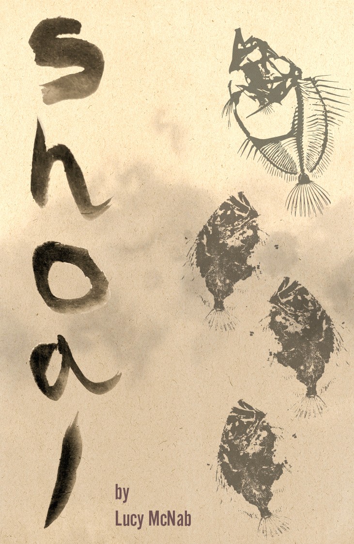
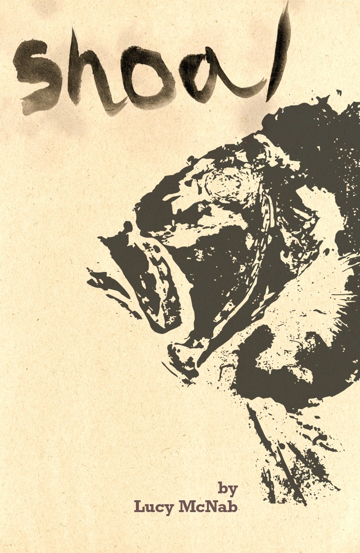
Shoal is a book cover project completed as part of my Graphic Design degree, responding to a brief built around the theme of "Imposter" and a publisher of our choosing. I selected Black Shuck Books, a small press specialising in horror and anthologies, and used their catalogue as the lens for the whole piece, designing not just a cover but a fictional title, blurb and story world to sit convincingly on their shelf. The brief was to make the design feel odd, macabre and slightly unsettling, in keeping with the theme and the publisher, built around Gyotaku, the traditional Japanese printmaking technique of taking direct ink impressions from fish.

Shoal

Sep 25, 2026

Shoal is a book cover project completed as part of my Graphic Design degree, responding to a brief built around the theme of "Imposter" and a publisher of our choosing. I selected Black Shuck Books, a small press specialising in horror and anthologies, and used their catalogue as the lens for the whole piece, designing not just a cover but a fictional title, blurb and story world to sit convincingly on their shelf. The brief was to make the design feel odd, macabre and slightly unsettling, in keeping with the theme and the publisher, built around Gyotaku, the traditional Japanese printmaking technique of taking direct ink impressions from fish.

CLIENT

N/A - As part of studies

CLIENT

N/A - As part of studies

Role

Graphic Designer

Role

Graphic Designer

Service

Graphic Design/Print Design

Service

Graphic Design/Print Design

Parallax image
Parallax image

Research & Direction

Research & Direction

I wanted the design to feel odd, macabre and slightly unsettling, in keeping with the theme and the publisher. I researched Gyotaku, the traditional Japanese technique of printing directly from a fish using ink, and felt it suited the idea of an "imposter" well, as the print is essentially a copy of the real thing.

I also looked at Black Shuck Books' existing covers to understand their style, noting that they tend to favour restraint and atmosphere over anything too graphic.
Design & Results

Design & Results

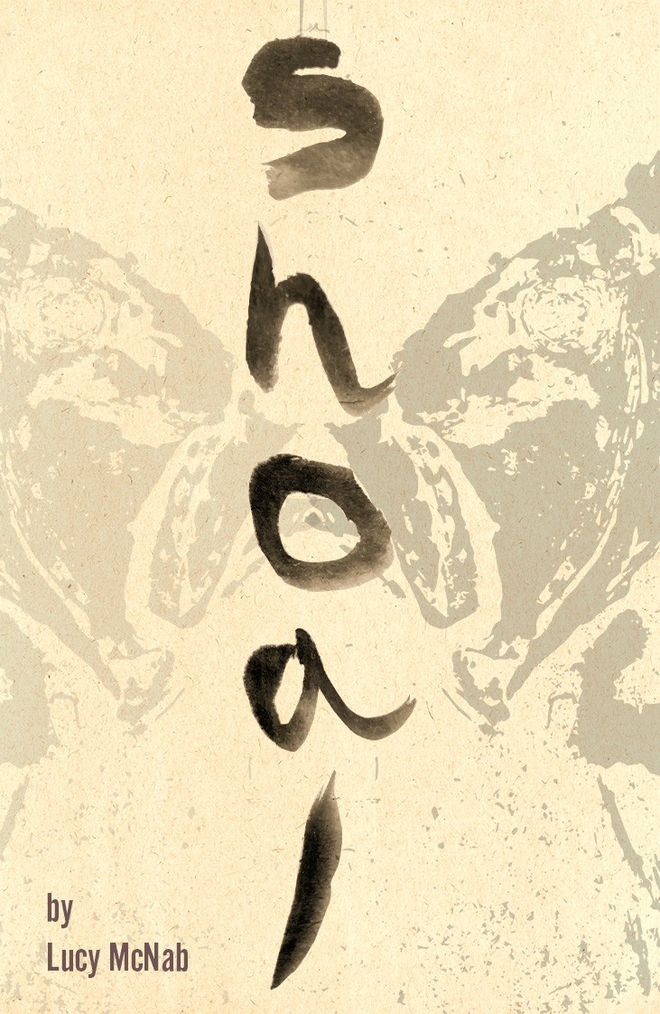
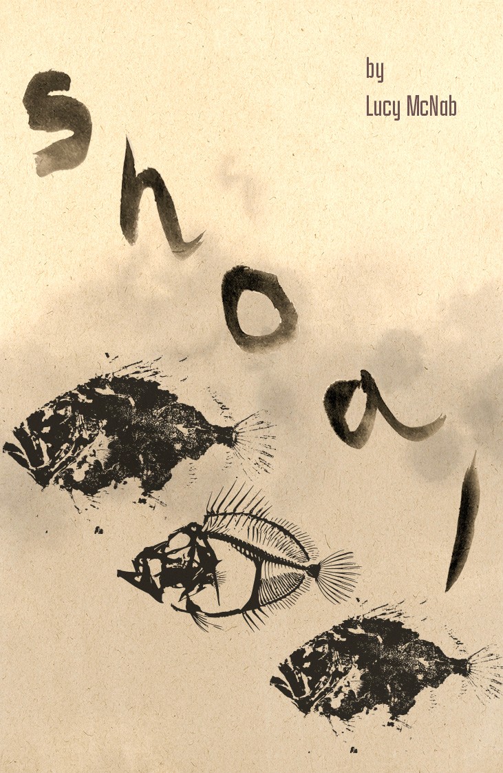
After a discussion with a local Fishmonger, I sourced a John Dory due to its size and fin interest, and created the prints myself, inking the fish by hand and pressing it onto mulberry paper. I then painted the title using sumi-e ink and a calligraphy brush, so the wordmark felt as hand-made as the prints themselves.

I tried a few different layouts before settling on the final cover. The final version uses a vertical title with a faded, mirrored fish print behind it, and the spine repeats the same lettering.

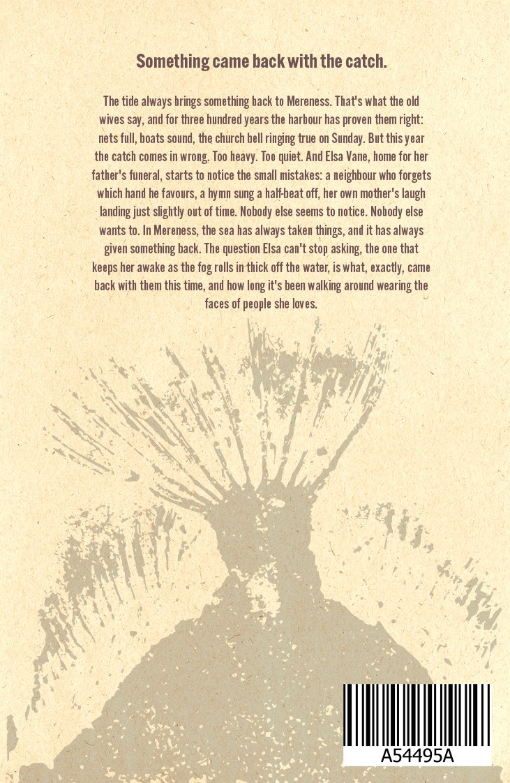
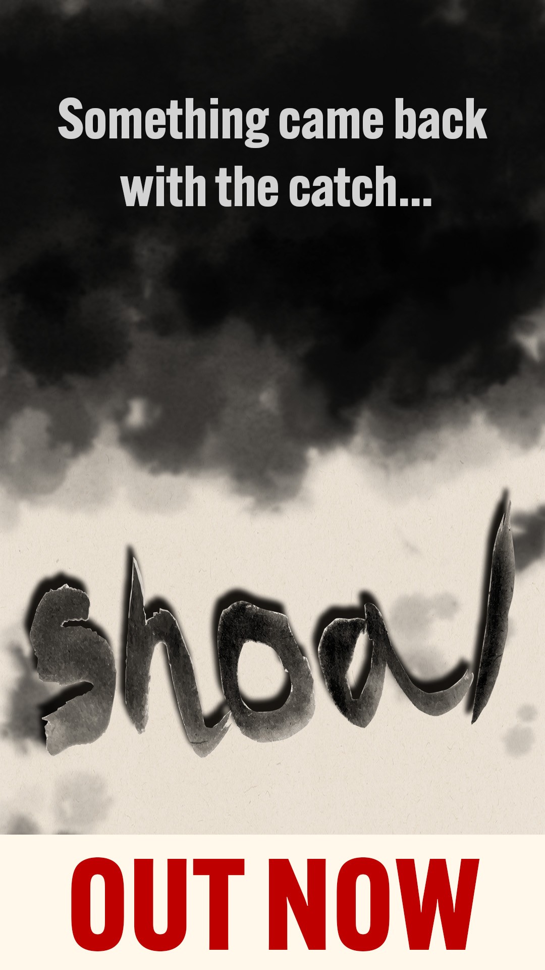
For the back cover, I wrote my own blurb and used the back of the fish to tie to the front. I also designed an Instagram story to promote the fictional release, reusing the same tagline and wordmark from the cover, emulating the feeling of going 'under the waves' with the title jumping out at you.