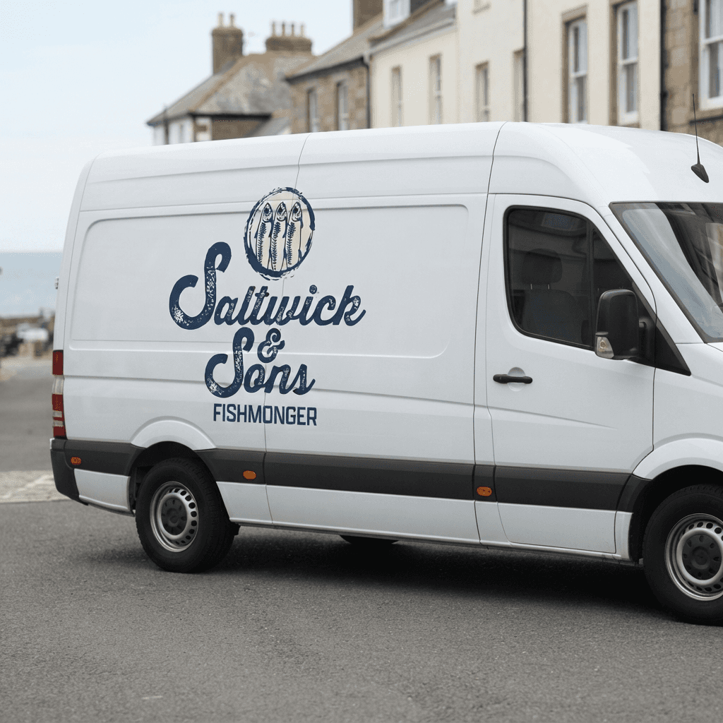
The creative direction was rooted in the weathered, working heritage of a third generation fishmonger, balancing an authentic sense of history with a brand that still felt current rather than dated.
I explored how illustration, typography and colour could work together to communicate provenance and daily freshness without leaning on cliché. A key focus throughout was distinguishing 'historical' from 'vintage', favouring handwrought, working references such as knots, boats and fish species over distressed textures or overly polished heritage tropes. The target audience, largely long standing regulars wary of change, shaped every decision to keep the identity grounded.


I sketched out some initial logo concepts, including boats, rope, anchors and fish. I eventually landed on the fish due to the ability to be instantly recognisable, scalable and linked to the trade. Three fish were used within the mark in reference to the '& Sons' of the name.
For type, Thirsty Rough Bold Two was chosen for its weathered, historical character, with the lettering refined further to ensure it held up at small scale, including shopfront and stamp applications, without losing detail or legibility. A rough brushstroke outline was introduced around the mark to soften its edges and bring a more hand-wrought, tactile quality, moving it away from anything too preened or polished.
Apotek Comp was chosen for the 'Fishmonger' section, as well as for non-display type. I felt like this brought out that brusque, industrial feeling.
Regarding colour, I created an initial palette from colours within the mood-board. A bolder, red led palette (from crabs, lobsters and trawlers) was explored early on but ultimately felt too striking for the brand and its audience, so the final palette was refined to feel steadier and more in keeping with the identity's understated personality.