The creative direction centred on building a restaurant brand that felt genuinely local and welcoming, a place rooted in familiarity and belonging rather than novelty or exclusivity. That positioning shaped every decision, aiming for something closer to a friend's kitchen than a destination restaurant.
I explored how a handmade, tactile approach could reinforce that sense of place, alongside how typography and colour could support a warm, welcoming and inclusive personality throughout. A key focus was avoiding corporate polish in favour of something that felt affordable and informal, whilst also championing quality food.


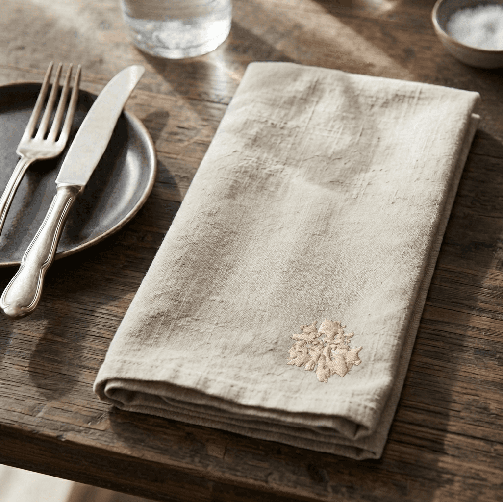
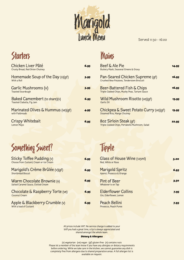
The visual identity was built around a hand-pressed floral print, created by dipping real marigold flowers in ink and pressing them by hand, then digitised and refined to sit cleanly alongside a hand-lettered word-mark.
Typography and colour were then considered. Two warm, gentle typefaces were chosen to support the identity without overwhelming the print, while the palette was drawn directly from the brand's namesake hue and deliberately avoided stark blacks or whites, keeping the overall feel comfortable and inviting rather than corporate.
The identity was then extended into a digital experience, with the homepage designed as a natural continuation of the physical space, honest copy, the same warm palette and an inviting reception.