
Role
Solo - UX Researcher, UX & UI Designer
Brief
UX Design Institute Project - Design a hotel booking website for an existing hotel review company, who want to expand their services.
Responsibilities
Usability testing, card sorting, affinity mapping, journey mapping, user flows, lo–hi wireframing, iterative prototyping
Tools
Figma, Miro, FigJam
Usability Testing
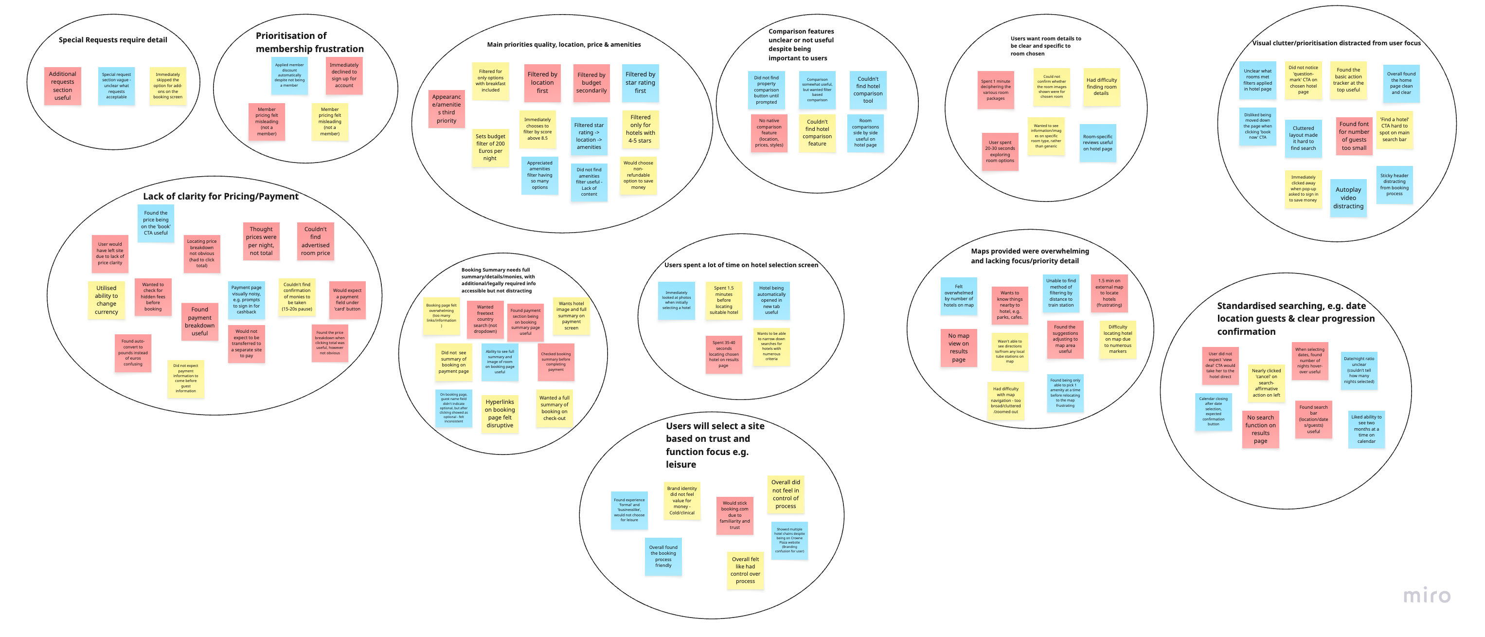
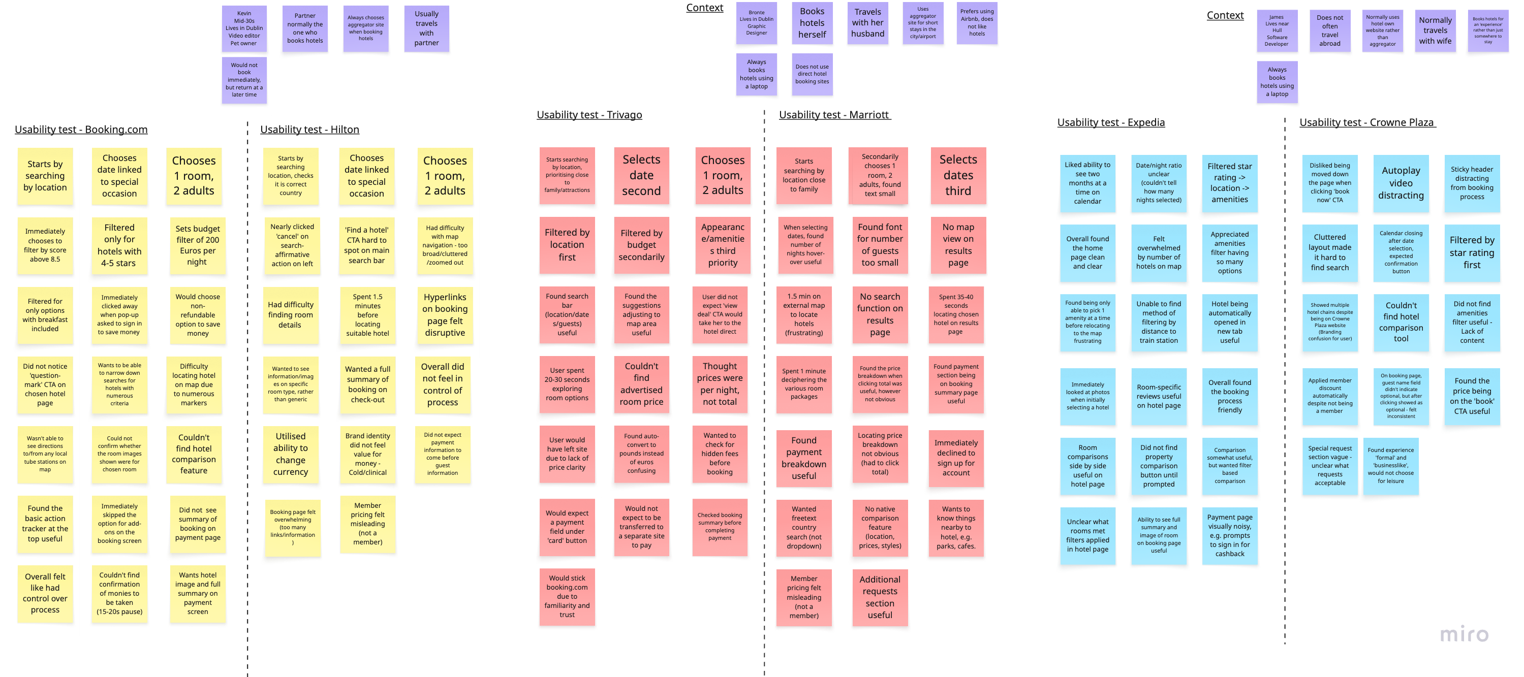
Three users were tested on competitor booking platforms using a structured interview script. Observations were compiled through card sorting and affinity mapping to identify patterns between users.
Visual clutter
Users reported feeling overwhelmed by non-essential information, ads, and heavy styling. They said this caused them to drop off.
Price confusion
Friction around whether prices shown were per night or for the full stay; some users considered abandoning at this point.
Map overload
Competitor maps were overwhelming and failed to identify what users actually needed, which was predominantly local transport and attractions.
Defining the Core Issues
Users struggle to understand total costs, feel uncertain about what they're booking, can't easily compare options, and lack enough location context to make confident decisions.
Design a booking experience with visible total pricing, clearer hotel detail, accessible comparison tools, and an interactive map prioritising transport and nearby attractions.
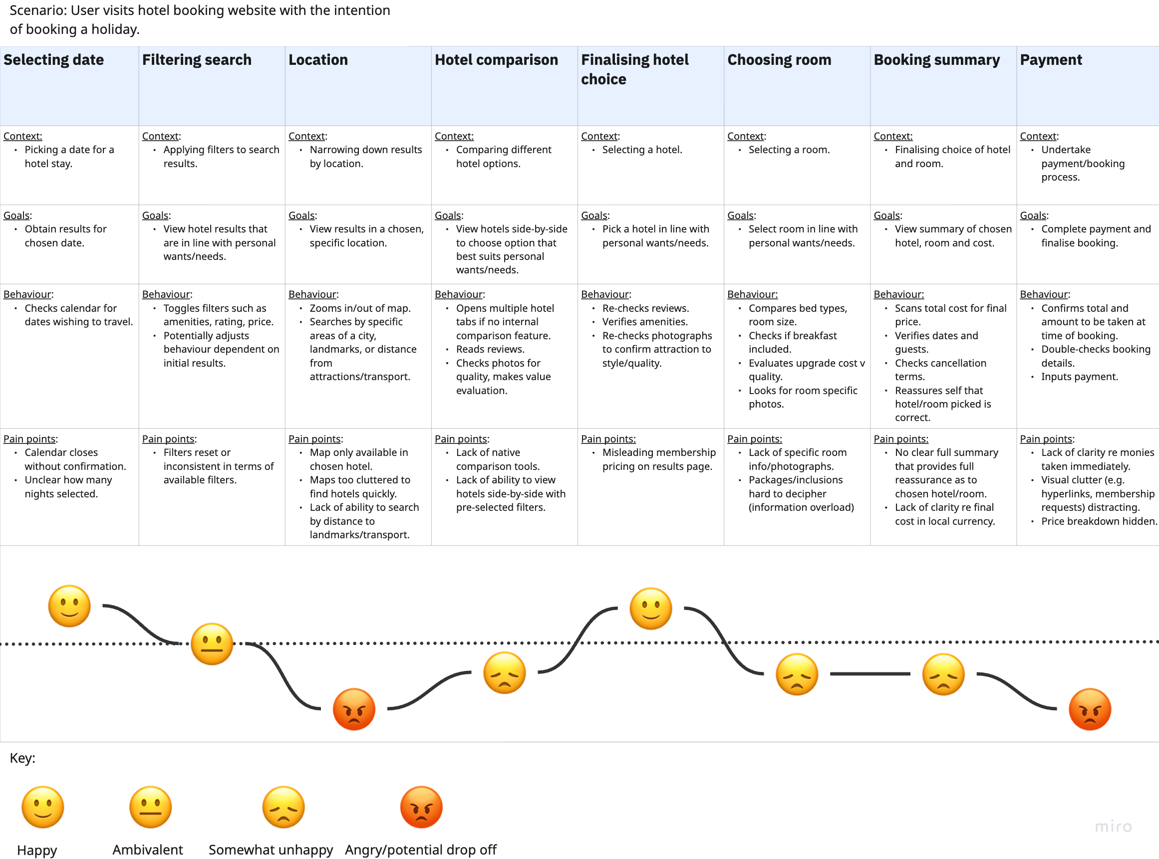
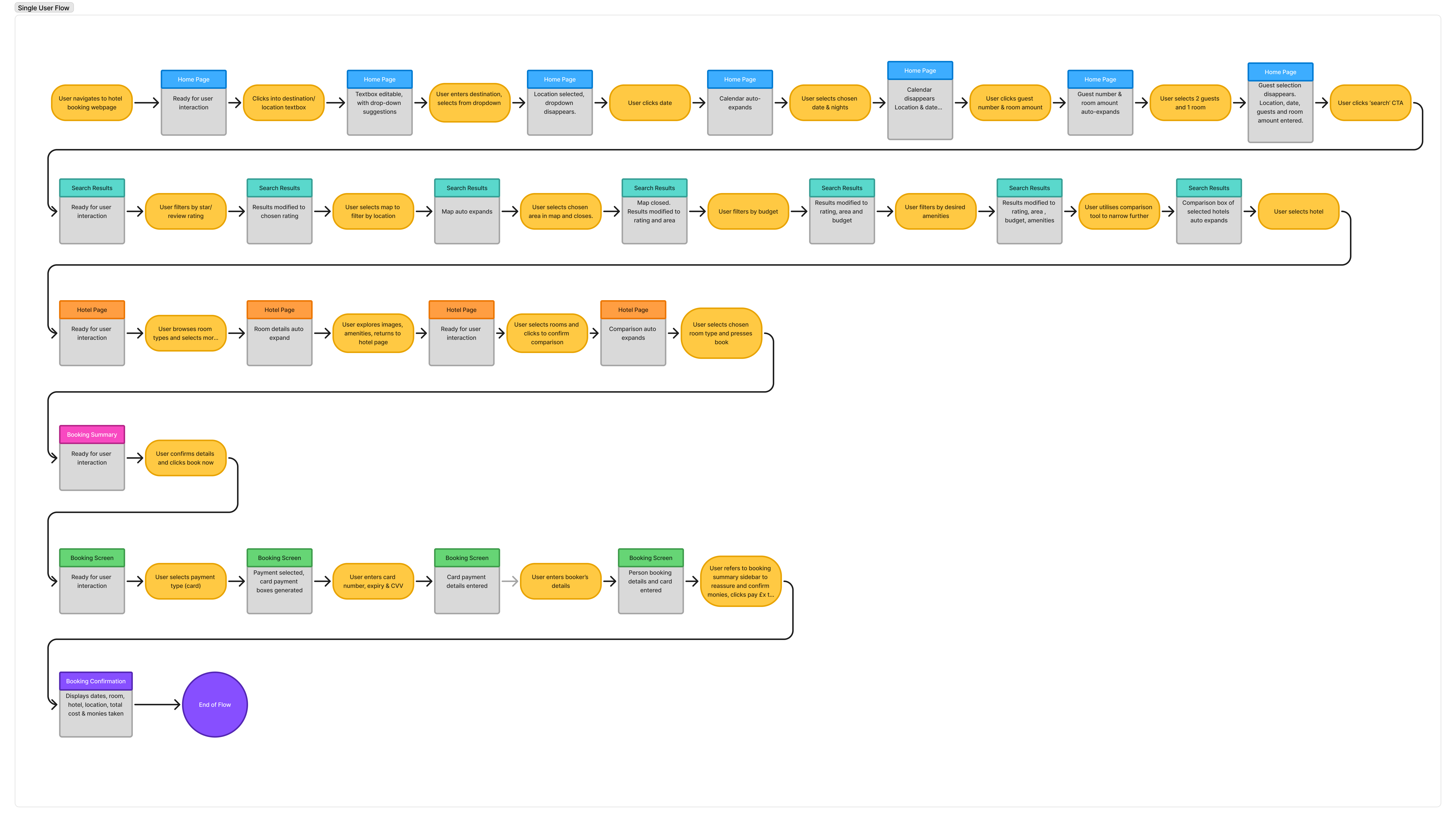
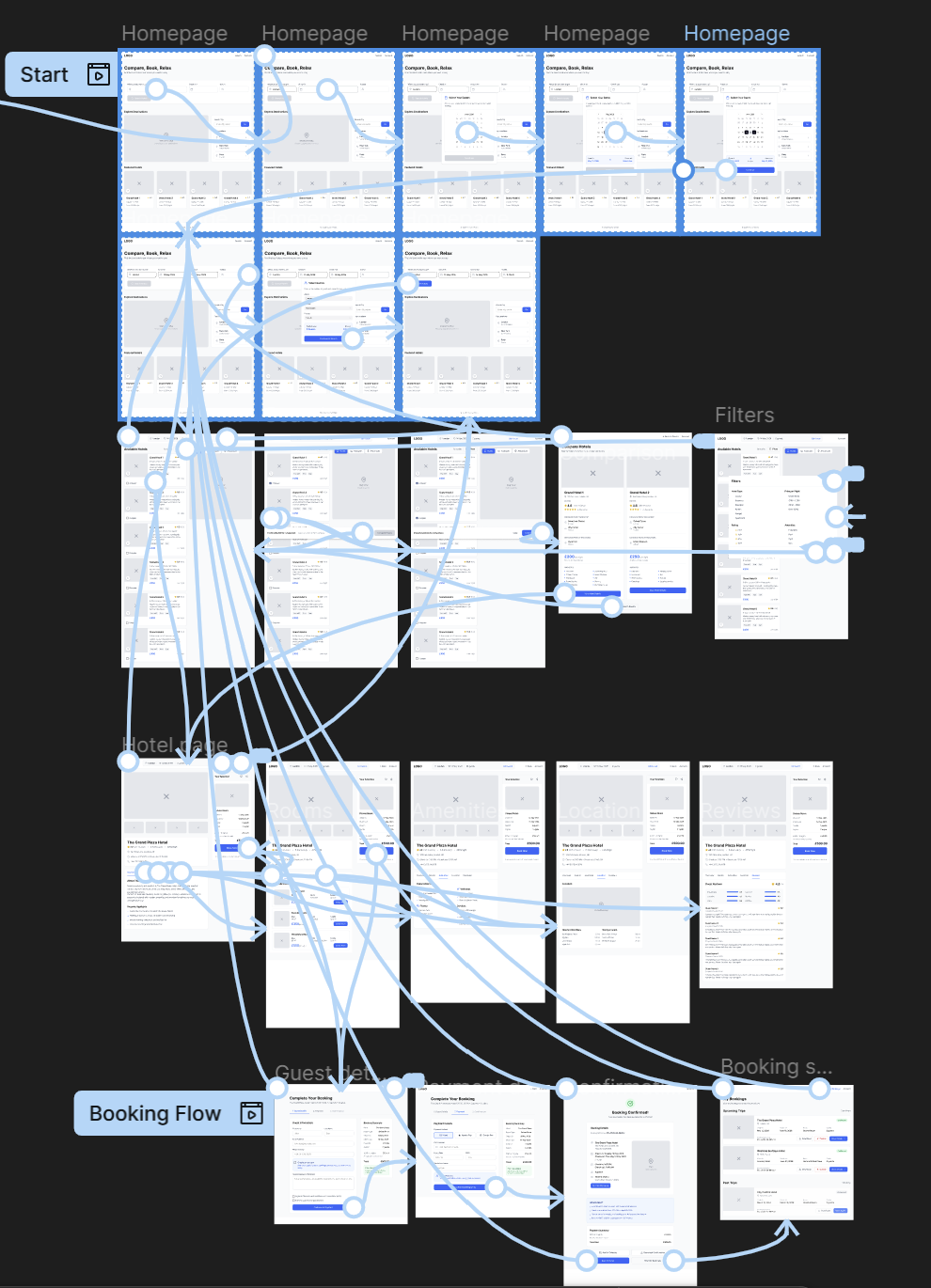
From Mapping to Low Fidelity
A user journey map broke the booking experience into stages, pinpointing where uncertainty peaked, particularly around costs at checkout and comparing options. This shaped what I prioritised in the design. A single user flow covered homepage to confirmation, keeping focus on location, comparison, and pre-payment confirmation.
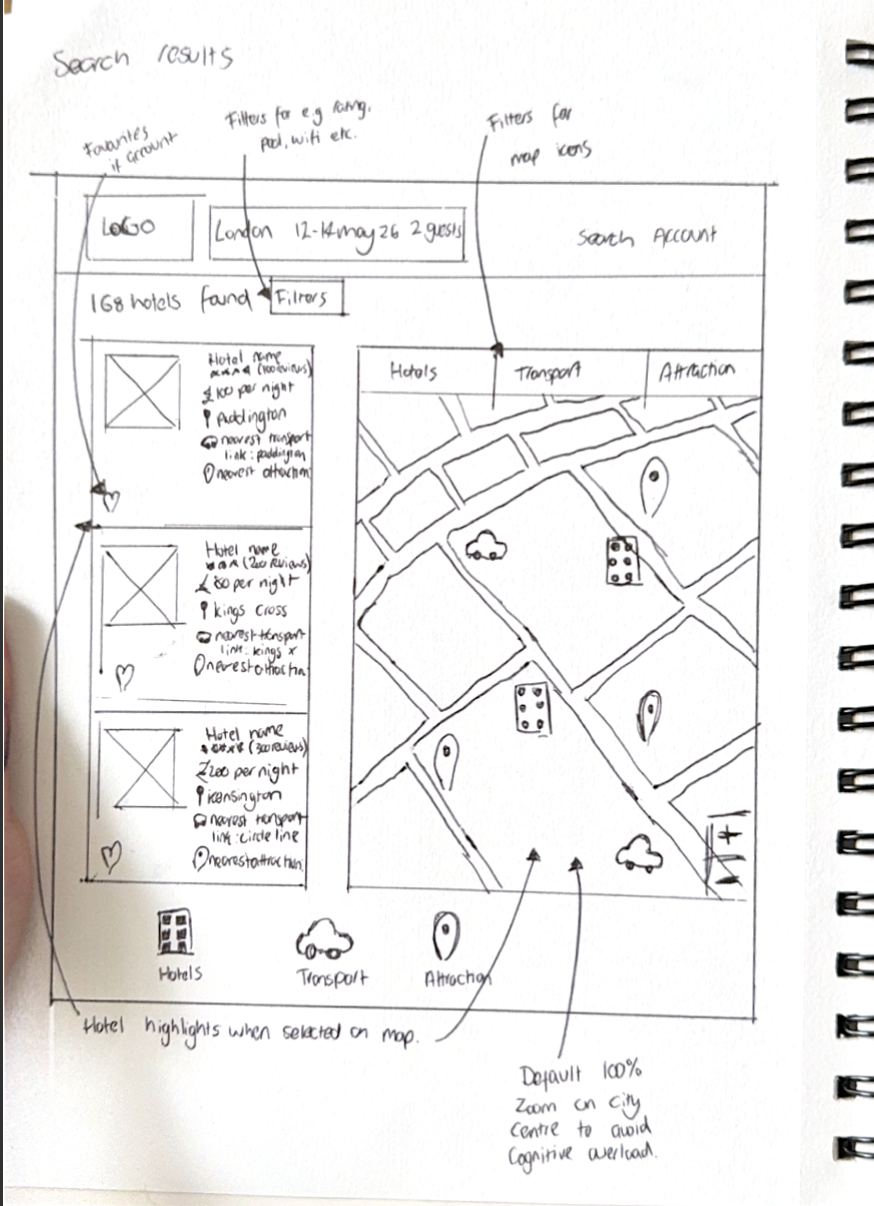
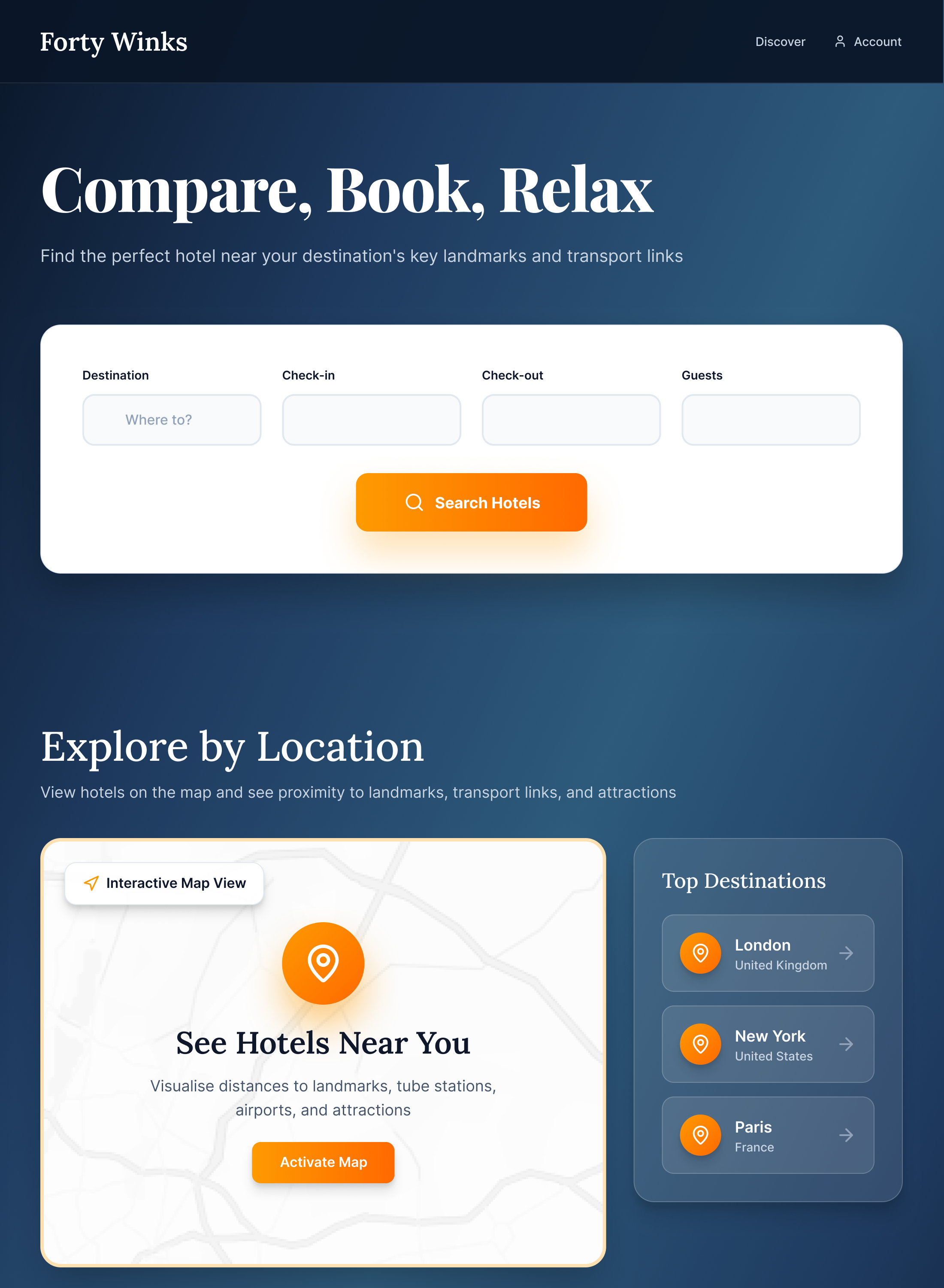
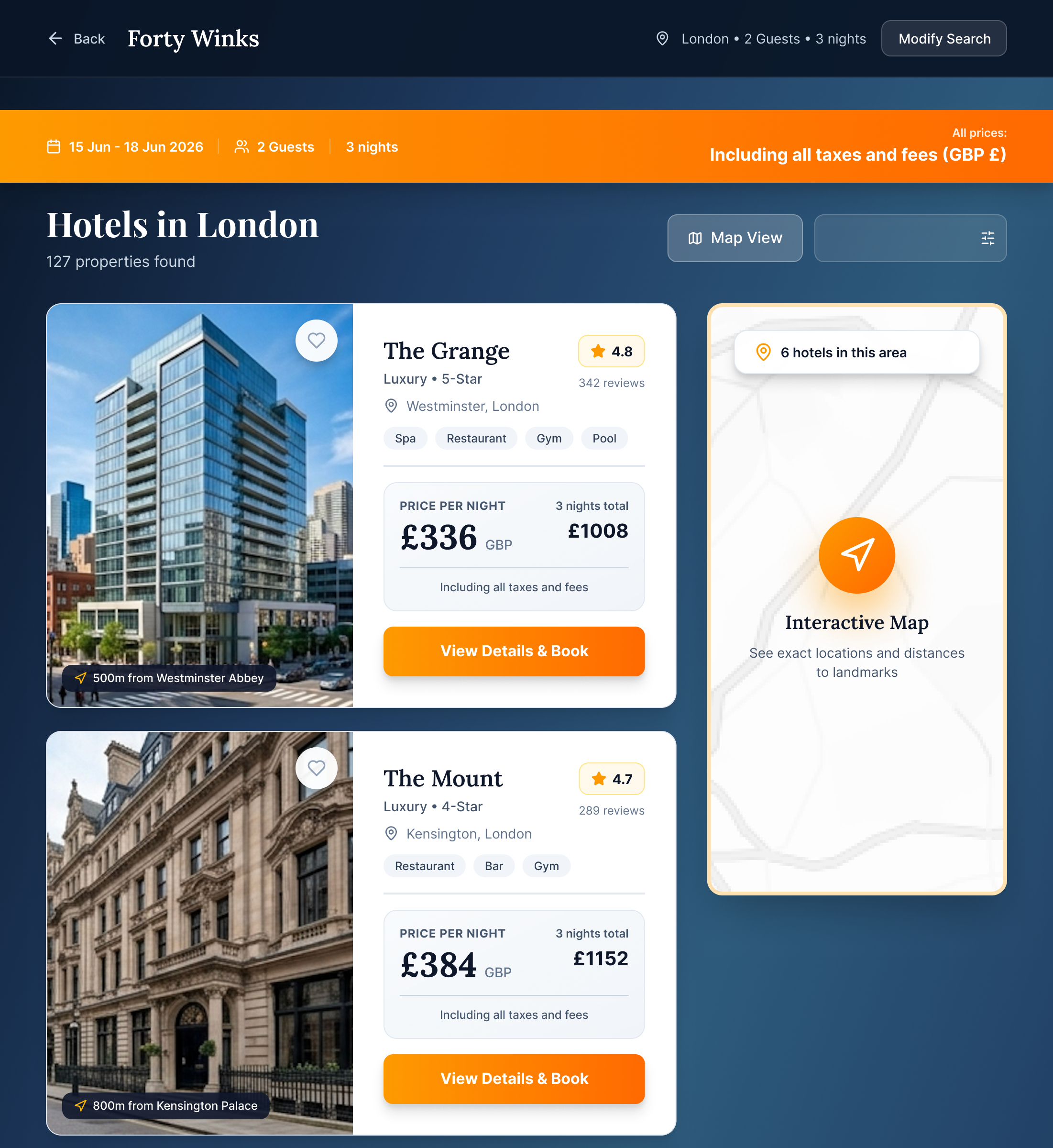
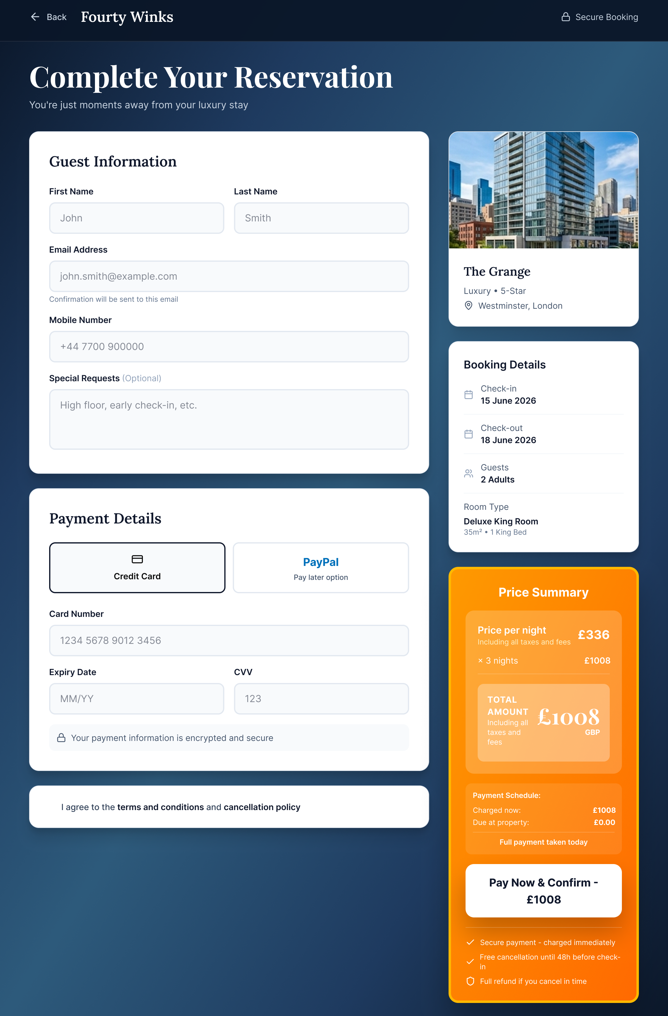
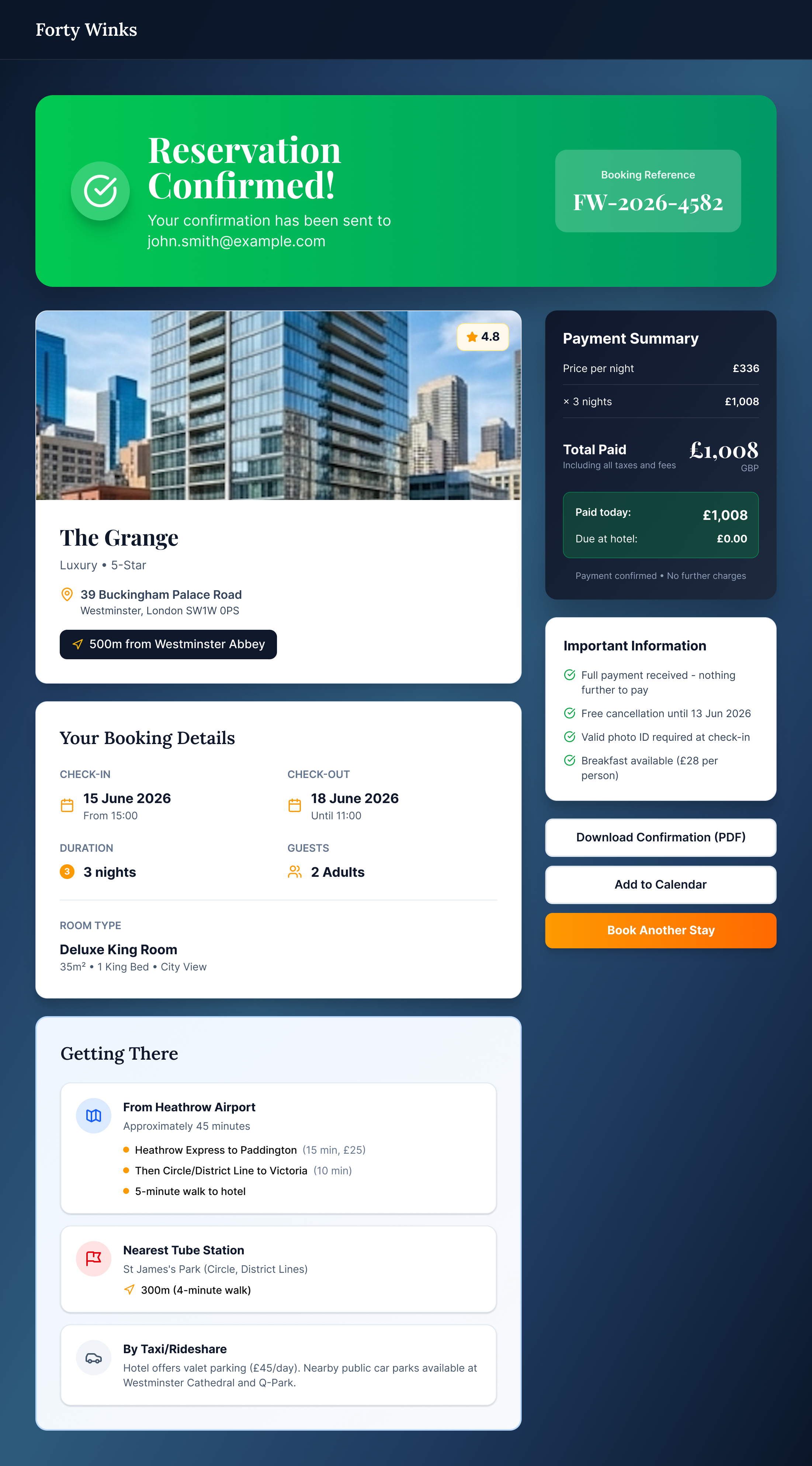
High Fidelity Designs
The final designs addressed all three core research findings. Pricing is visible and broken down earlier in the flow. Comparison features are clearly surfaced. The interactive map prioritises transport and local attractions over raw geographic data.
Prototype Testing
An interactive prototype was tested against three key tasks: understanding pricing, comparing hotels and location, before completing the booking flow. Users found pricing clearer felt positive about the curated map. Feedback highlighted a need for stronger confirmation and reassurance at the final steps.
What I Learned
Clarity is king, particularly when users are making emotive purchases for significant monetary sums. Further prototyping surfaced smaller issues that weren't visible at earlier stages and was invaluable. With more time, I'd test with a larger, more varied group. I'd also want to develop the map idea, considering how that might work in practice in terms of each hotel having to provide distance data for landmarks and transport links in practice.
The main challenge for this project was the small sample size for research, as well as the fact it involved no engineering or business stakeholders. I wasn't able to engage with developers to explore things such as the map, how that might work in practice, blockers or constraints, nor have discussions with the client about ways to link in the existing website or provide some form of cross-integration.